Why Print Quality Matters: Design Tips to Make Your Prints Pop
Share
In an age of digital displays, great print still turns heads — but only if the design and finishing are done right. Here’s how to make sure your printed materials look sharp, vibrant, and professional.
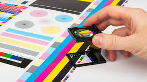
1. Color matching: Digital vs. print
It’s tempting to design in RGB (red, green, blue) because screens use it — but print works in a different world: CMYK (cyan, magenta, yellow, black). Colors that look rich online may dull or shift when converted to CMYK. Use the Pantone Matching System (PMS) when possible for accurate, consistent color across different printed pieces.
Tip: Always ask your printer if they accept or prefer PMS color values. That helps keep your brand color intact.
2. Use high-resolution images (300 dpi or better)
Low-resolution images look fine on screen, but they break apart in print. To avoid pixelation and blurry edges, your images and graphics should be at 300 dpi (dots per inch) at the final print size. If you scale up a small image, you’ll lose clarity.
Before sending files: Check your image dimensions in inches or mm × resolution. If something looks small or grainy at full size, find a higher-res version.
3. Pick the right file formats
What file type should you send your printer? The best choice is usually PDF, because it preserves layout, fonts, and embedded images without surprises. A well-prepared PDF is “print-ready” — meaning you’ve flattened transparencies, embedded fonts, included bleed/crop marks, and ensured proper color space.
Other acceptable formats may include TIFF (for images) or EPS (for vector art), depending on what your printer supports. Always double-check your printer’s preferred formats.
4. Don’t forget bleeds, margins, and safe zones
When elements (e.g. background colors or images) extend to the edge of your print, include a bleed (usually 3 mm or 5 mm) to allow for trimming. Keep important text or logos at least a safe margin (away from the edges) so nothing gets cut off.
5. Proof, proof, proof
Before full print, always ask for a proof — either a digital soft proof or a physical sample — to check color, alignment, and overall look. A proof helps you catch costly mistakes before large runs.